Tuesday, 27 April 2021

The First Production-Methods-Based Superhero: Captain Extruder by Rain Noe


As first-year Industrial Design students in Production Methods 101, the easiest method for us to grasp was extrusion: The professor just said "Play-Doh Fun Factory" and all of us got it. But it wasn't until well after graduation that I learned the material being extruded was not propelled by a child pressing a lever, but by a rotating screw.

Manufacturing company US Extruders was founded by Bill Kramer, a longtime engineer who literally wrote the book on single-screw extruders (at least, he wrote the chapter called "Single Screw Extruders" for the Society of Plastic Engineers' Extruder Technician's Toolbox). And to spice up their ads, the company has attempted to tap a bit of Marvel magic with the creation of their own superhero, the screw-wielding Captain Extruder:

Okay, so it's not exactly The Falcon and the Winter Soldier. But now that that series has ended, I'm grasping at straws.


from Core77 https://ift.tt/2QZP2yy
via IFTTT

Friday, 23 April 2021

How Arrival Designed Their Vehicles to Sidestep the Most Expensive Parts of Automobile Mass Production by Rain Noe

We've already talked about the design of Arrival's electric delivery vans. Now let's talk about that all-important first half of the term "industrial design:" How do they plan to produce these? Here are the strategies they're hoping will make their microfactories more efficient than traditional mass production, and enable them to deliver more affordable product to their customers.

First off, it takes hundreds of millions to over a billion dollars to set up a new auto plant. You need to hire a couple thousand workers to man it, and pump out six figures' worth of vehicles before the economies of scale start to return any profit.

How the big dogs do it

Arrival says their microfactories--of which they're planning to build three so far--will run just $50 million each. That's relative chump change.

An Arrival Microfactory

To whittle the cost that low, they've designed their vehicles to not require the three most expensive parts of a traditional auto factory: The gigantic presses that stamp the body parts, the welding robots, and the painting area (which, these days, also requires expensive robots). Those areas typically run in the hundreds of millions.

Arrival has managed to eliminate those three pricey production elements by doing away with as much steel as possible. That gets rid of the stamping presses and the welding 'bots. In place of steel they're using "components made from advanced composites, a mix of polypropylene, a polymer used to make plastics, and fiberglass," according to the Times. "These parts are to be held together by structural adhesives instead of metal welds." And to do away with the paint shop, Arrival simply has the composites produced in the desired colors.


Then there's the footprint. A traditional factory needs acreage, multiple hangar-sized buildings, tons of fixtures, and lots of set-up time to get it all together. In contrast Arrival's microfactories "can be deployed quickly, making use of existing commercial spaces," the company writes. I got my vaccination shot in a decommissioned J.C. Penney. There's plenty of those around, not to mention shopping malls.

Because Arrival is doing away with the Henry Ford production line and going with "cell-based assembly:" A half-dozen workstations where teams of less-expensive-than-welding-'bots robots and/or humans complete a particular phase of the build, before the vehicle is wheeled over to the next station--there's more flexibility of layout.

"We realise that products need to be defined by the processes that make them," the company writes. "Designing vehicles for Microfactory assembly is core to our product development process and is an essential part of what makes our vehicles unique."

Arrival currently has a microfactory set up in Bicester, England and is in the process of setting up their first U.S. microfactory in Rock Hill, South Carolina. A third is scheduled for Charlotte, North Carolina.

All if it sounds good on paper; now we've got to see how smoothly everything actually works in the real world. I know Elon Musk is watching and wringing his hands, but I can't guess if his expression is worried, or more "Wait 'til you guys see what you're in for."


from Core77 https://ift.tt/3xfrWoo
via IFTTT

Thursday, 22 April 2021

Why "Less is More" in Industrial Design is Hard: We're Cognitively Biased to Add, Not Subtract by Rain Noe

If your kid's learning to ride a bike, you'll add training wheels. But one of the smartest "hacks" I ever saw was in Japan in the '90s, where a clever father removed the pedals on his kid's bike. The kid sat on the bike and went up and down the street, Fred-Flintstone-style, using his feet to move forward. After 20 minutes, the father put the pedals back on. The kid then pedaled away--very wobbly and halting, but he did not fall over. His body had already grasped how to balance by hoofing around on the bike. And the father didn't have to buy training wheels.*

Look at this LEGO construction, below. It won't stand straight. How would you fix it in one move?
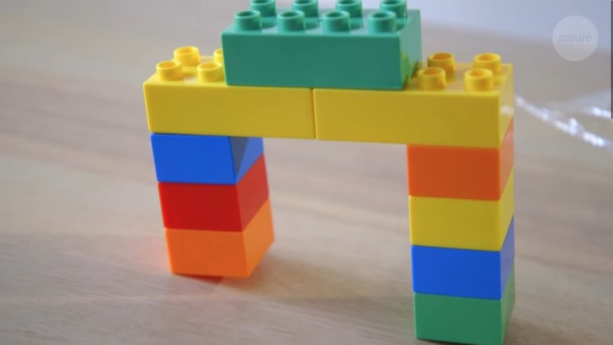
Chances are your instinct was to add a brick to the left side. It occurs to far less people to remove a brick from the right side.

Why? Leidy Klotz, a University of Virginia engineer and architecture professor who "studies the science of design," was playing with LEGOs with his son when he experienced the example above. "I reached behind me to grab a block to add to the shorter tower. As I turned back toward the soon-to-be bridge, three-year-old Ezra was removing a block from the taller tower. My impulse had been to add to the short support, and in that moment, I realized it was wrong: taking away from the tall support was a faster and more efficient way to create a level bridge."

Klotz brought the LEGO test to Dr. Gabrielle Adams, a fellow UVA professor who teaches experimental design. She, too, instinctively added a block to the shorter tower. Klotz told her Ezra's solution.

"Oh," Dr. Adams said. "So, you're wondering whether we neglect subtraction as a way to change things?" A study, "People systematically overlook subtractive changes," was born.

Klotz and Dr. Adams worked with psychology professor Ben Converse and postdoctoral student Andy Hales to design eight experiments where test subjects could choose to add or subtract elements to a variety of tasks. As one example, they were shown this pattern on a grid, where they can add or remove green squares. They were asked to make the pattern symmetrical.

78% of participants did it by adding green squares to the left rather than subtracting from the right.

Participants were asked to improve an essay they had written. 80% added text, rather than subtracting.

In this modification of the LEGO test, participants were asked to "improve" the design, with the only stipulation being that the figure must still be able to fit beneath the roof:
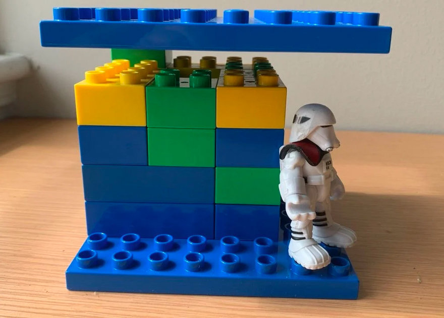
The majority added more supports to the roof, rather than simply removing the one block that prevents the roof from sitting flush.

"We asked research participants to make changes to designs, essays, recipes, itineraries, structures and even miniature-golf holes," the researches write. "Our studies show that people's first instinct is to change things by adding. When they are able and willing to think a little longer, they are perfectly capable of finding subtractive changes. But they usually don't think longer. They quickly identify an additive idea that is good enough, put it into action and move on."

The researchers found that simply reminding the participants that subtraction was an option, increased the chances that they'd use a subtractive solution. They also found that distracting subjects during an experiment--increasing their "cognitive load" by requiring them to simultaneously check a sequence of numbers scrolling across a screen--led them towards additive solutions, which appears to be our natural cognitive bias.

Think of those scrolling numbers as an avalanche of e-mails

So, if you're a design manager and you'd like to see more pared-down designs from your team: Remind them that less is more. Don't distract them with managerial B.S. when they're getting in the zone. And if you can afford to relieve them of even a little time pressure (I know, fat chance), do it.

Klotz, by the way, subsequently wrote a book on the subject: "Subtract - The Untapped Science of Less."

"Whether we're building Lego models or cities, grilled-cheese sandwiches or strategic plans, our minds tend to add before taking away. Even when we do think of it, subtraction can be harder to pull off because an array of biological, cultural, and economic forces push us towards more. But we have a choice—our blind spot need not go on taking its toll on our cities, our institutions, and our minds. By diagnosing our neglect of subtraction, we can treat it."

_________________

*Sadly, I've learned that the remove-the-pedals trick was commercialized by an American inventor in 2007 into a bicycle manufactured without pedals. It's even cited in the researcher's work. But rather than purchase a no-pedals bike that becomes worthless to the child once they've mastered balance, I think temporarily removing the pedals of an existing bicycle is far less wasteful in the long run. So ironically, this no-pedals bike is actually an example of additive thinking.


from Core77 https://ift.tt/2Qfsv11
via IFTTT

The Best New Design from Apple's Event: The Siri Remote by Rain Noe

The most interesting new design I saw in yesterday's Apple presentation was not their new computing devices (thinner, faster, blah blah blah) but their redesigned Apple TV remote control.

As a non-TV-owner, my experience with remote controls has been limited to (pre-pandemic) visits to friends' homes and hotel room stays. There I was always bewildered by this object:

The flaws of this object should be part of every industrial design program's curriculum. I don't know how anyone over the age of 50 uses this thing effectively, nor who uses all of those buttons, or even knows how to.

In contrast, the new Siri Remote is a notable evolution on the form as well as an improvement over its predecessor.


Apple's last remote was black and hard to see; the new one is silver with buttons in black for high visual contrast. And the last remote featured an ill-advised invisible touchpad at the top, for swiping through on-screen menus. Reviewers hated it and found it imprecise.

Last generation, left. New one, right.

Thus the new remote goes back to an interface that worked well, the old iPod's touch-enabled circular clickpad. Four clickable dots at the compass points provide more precise input than vague directional swiping, and the circular pad can be used for rewinding and advancing footage.

The buttons have been shifted around a bit, versus the last generation. A separate power button has been added for the screen, a "back" button has been added, and the button that activates Siri has been moved to the side, in the manner of the "talk" button on a walkie-talkie.

I do believe that this design (and admittedly, the evolution of on-screen menus) has boiled a physical remote control down to its absolute bare essentials.

If there's one trick they missed, I'd say they ought have put in some kind of locating feature, where you say "Where's the remote" and the thing emits a chirp. But maybe they left that out on purpose, so you'd buy one of their new AirTags.


from Core77 https://ift.tt/32MYCI5
via IFTTT

Friday, 16 April 2021

ID Student Work: A Portable Rendering Kit by Rain Noe

As many of us once did, industrial design student Yi-Miao Lai has to haul her markers and colored pencils back and forth from home to school. Thus Lai, who studies at Taiwan's National Kaohsiung University of Science and Technology, designed a carrying case sized to her studio desk. It doesn't make carrying the materials any easier, but it does make set-up a breeze:

I can't read Chinese. If you can, and some non-obvious feature is being called out in the drawings, please let us know in the comments.


from Core77 https://ift.tt/32hSqaJ
via IFTTT

Saturday, 10 April 2021

Sori Yanagi's 1972 Subway Kiosk, and the Importance of Modelmaking in Design by Rain Noe

Japanese industrial designer Sori Yanagi is perhaps best known for his Butterfly Stool from 1954:

Image: tomislav medak - München : Butterfly Stool by Sori Yanagi, CC BY 2.0

A lesser-known object he designed is this super-cool kiosk he was commissioned to design for the Yokohama Municipal Subway in 1972:

I think it still looks futuristic today, and I'm digging the armadillo-style security closure. As for the door, that may or may not have been fun to squeeze through, but I can see Japanese workers using it without complaint.

Yanagi was known for his fastidious modelmaking approach to design, rather than designing purely on paper (or later, in CAD). This extra step required both time and money, trying the patience of some clients, according to this translation from the description:

"Yanagi's obsession with modeling occasionally annoyed the people around him, but Akira Tamura (urban designer), who was the right-hand man of the mayor of Yokohama at that time and the director of the planning and coordination bureau, said, '[Yanagi's designs for the subway] may cost several times more than a pedestrian bridge, but it's worth it if it remains culturally.' Tamura advocated for Yanagi's design."

While Yanagi passed away in 2011 at age 96, his firm Yanagi Design lives on, producing designs for tableware, furniture, bridges and buildings. And they still maintain their founder's model-based approach to design:

"When designing, we always think while making a model. At first, make a simple model with paper etc. and gradually put it together in a shape that you can imagine. We will further improve the accuracy of the model, try using it by the designer himself to check the ease of use, and explore the direction of the design by looking at the balance of the shapes. This kind of model-making experiment is carefully repeated until the design is completed.
"Verification with a model is not only visible, but you can actually touch it to check its usability and shape. It is not possible to make detailed judgments by drawing beautiful sketches on paper or using CAD to create shapes. The method of consistently making and examining models from the beginning to the end has been continued since the establishment of the office as an effective means for design ideas."

Check out Yanagi Design's Instagram here.


from Core77 https://ift.tt/39VzpPo
via IFTTT

Wednesday, 7 April 2021

Great ID Student Work: "Rotate" Concept for an Ergonomic Restaurant Cart by Rain Noe

I spent much of high school and college working as a waiter, and have rarely seen products designed specifically to make a server's work easier. (One notable exception is this ketchup-marrying gem.) So this ID student project, by Wang Yuwei and Wu Xuanqi from the Department of Industrial Design at Taiwan's National Kaohsiung University of Science and Technology, jumped out at me.

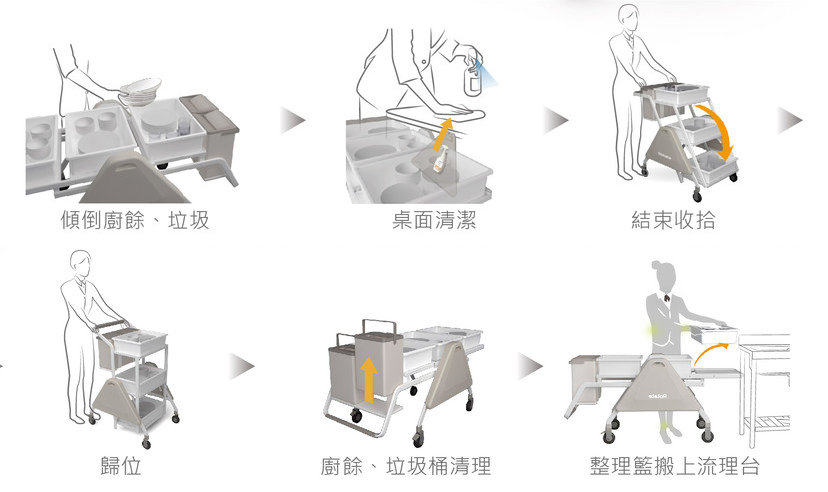
Called the Rotate, it's a cart designed to make cleanup easier. Typically in a restaurant you're clearing one table at a time, which can be done with one or two bus bins. But when you're cleaning up after a large group, baby shower, birthday party et cetera, that can take you a half-dozen trips, and you're always under time pressure to turn the tables over. You can use a utility cart, but getting a fully-laden bus bin in and out of the lower shelves is murder on the back.

The Rotate cart provides enough room for three bus bins and two garbage/recycling containers, presented at an ergonomic height for loading and unloading.

When it's time to maneuver the cart between the narrow spaces between tables, the bin supports pivot to place them one above the other, making the task far easier.


Thoughtful touch: A cover on the side conceals cleaning products/implements that diners may not want to see as you roll past them, but which you might need to clean up severe messes at the target table.

Nice work, Wang and Wu!


from Core77 https://ift.tt/3fNm7YT
via IFTTT

Great Industrial Design Student Work: The Attaché Folding Stool by Rain Noe

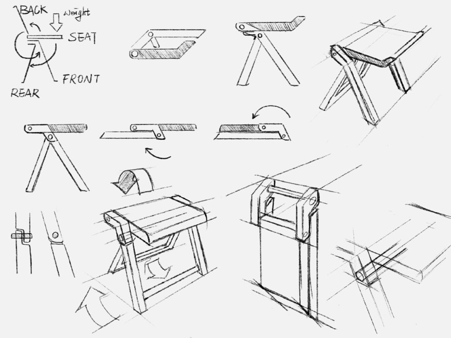
"There are some problems with folding furniture," observed mechanical engineer Chi-Hao Chiang, who left his native Taiwan to pursu...